
Research on top app store games indicated that casual players who engage (and spend) the most prefer to play in short bursts, during a commute for example. The same players tended to value attainable progression within those limited windows of time.
Dragonfire's hypothesis is that, if those complexity-curious players could be spared the friction points common to our market competitors, they would be more likely to engage with the deeper progression offered.
The core design challenge of Dragonfire revealed itself: Bring the depth of the 4x strategy genre to a casual mobile player base.


Dragonfire's player personas appreciate strategy and depth, but might struggle with the complexity and information density inherent to the genre. Research on market competitors (LOTR: Rise to War, Epic Age, etc) suggested that players of similar 4x titles often express frustration with the games' cognitive overload, long timers, and scarce rewards. These players valued attainable progression inside short sessions of play, and a frictionless user experience.
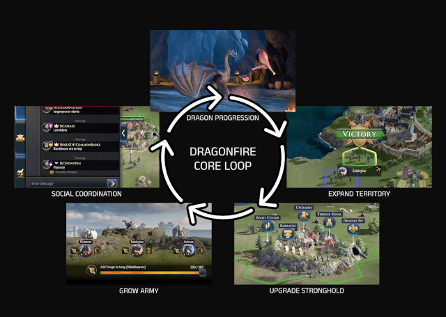
A diagram of the Dragonfire core game loop: Expand territory, upgrade stronghold, grow army, social coordination, and dragon progression.

My primary role was to work with product owners and designers to research, map, visualize, and prototype the intended player experience. I oversaw the testing and iterating of solutions in response to feedback. I also coordinated with engineers, QA, art et all to define unknowns in terms of scope and implementation.
My background was in live service games, so I had plenty of relevant experience to bring to the Dragonfire team. I was very excited to work on a game in preproduction for the first time. The opportunity to build a game for usability from the ground up appealed to me very much.
I also had the opportunity to do some mentoring. I participated and sometimes lead twice-weekly UX team design jams where I assisted team members with explorations and problem-solving. I also fielded, documented, and triaged feedback as it came in from various sources over the course of production.
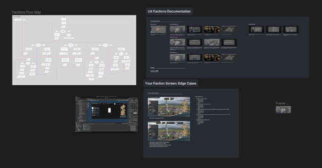
A screenshot of some documentation in Figma.

The business development folks set the success metrics that would be the basis for many decisions going forward, largely based on KPIs concerned with engagement and retention over time.
We formed hypotheses based on research and tested our solutions. First using clickable prototypes, and later iterating directly in the dev environment. A/B testing was performed on solutions with a high degree of uncertainty. After the core loop was built, the whole team engaged in daily playtesting.
Not everything translated seamlessly from prototype to actual game experience. That's something I learned early on while shipping new features for live games. This really emphasized the importance of having the resouces to iterate before shipping a feature, a luxury that was rarely afforded for live game updates.
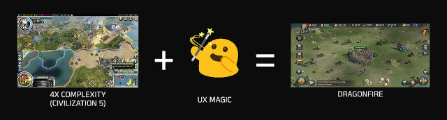
A diagram of Dragonfire's simplified UX formula: Take the complexity and depth of popular 4x strategy games, apply UX magic, and you get Dragonfire.

Player drop-off, particularly during onboarding, is a major concern for similar titles. In our research we identified several opportunities to reduce churn that could be applied to Dragonfire. The idea was that if we could keep casual gamers from feeling overwhelmed, they would be interested in the complexity that the genre had to offer. Respecting the player's time and mental resources would invite them to return for a fun and seamless experience time after time.
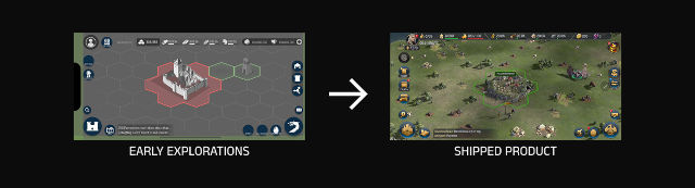
A diagram depicting how early wireframes translated to the final product using the HUD as an example.

Dragonfire's solution to the player dilemma is an accessible 4x strategy game with a snappy core loop that fits into multiple short sessions of gameplay. It uses progressive disclosure to introduce complexity, one decision at a time, to reduce overwhelm. It offers attainable progression within those sessions, using micro goals and rewards to make time invested feel meaningful. And lastly, it would keep players engaged over the long term with seasonal content while also building a permanent legacy.
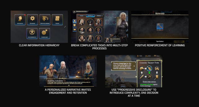
A diagram showcasing the core pillars of Dragonfire's UX: Use a clear information hierarchy, break complicated tasks into multi-step processes, use positive reinforcement of learning, personalize narratives to invite engagement and attention, and use progressive disclosure to introduce complexity one decision at a time.

The process always begins with research. Information gathered helped us identify potential solutions to explore. As the owner of several key features, I worked with product owners to understand the intent behind each mechanic and the business KPIs implicated. With design, I explored ways to simplify and present complex game concepts for a casual player base. I created prototypes to inform development and shed light on open questions around accessibility.
From there I would narrow down the scope of a design early, before a feature entered production, by having developers weigh in on the UX approach during prototyping. With plenty of time before development, we found many limitations and friction points to address. Upgrades, for example, required more streamlining to keep the player moving through the flow.

A diagram explaining the Dragonfire UX process loop. Research, map user flow, explore wireframes, make clickable prototypes or prove in the dev environment, playtest, refine, and repeat.

Because Dragonfire launched with streamlined onboarding, players in soft launch regions were responding as expected: engaging in short, meaningful bursts multiple times per day and demonstrating interest in the game's seasonal content.
Onboarding was a critical experience to get right. We partnered with UX Is Fine to craft the most casual-friendly onboarding experience we could have, while the internal team focused on the core loop. Internal WB testing proved invaluable; we even had access to the specialized accessibility QA team for WBG.
Our biggest contributing wins included:
-Offering player milestones early in the experience (within the first session) that feel earned and rewarding
-Goals that were based on rewarding deep engagement and retention
-Reducing the player's cognitive load by gradualy teaching complex mechanics
-Providing automation that allows the player to feel powerful and competent, giving them reason to feel emotionally invested.

A screenshot of the promo video featuring Steve Toussaint playing the Dragonfire on a phone. His character Corlys appears in dialogue on the screen.

Minigames were later added to give the player more achievable micro tasks. More "durable" avenues of progression (ones that don't reset each season) will also be a focus going forward, adding value to the player's account with time.
Seasonal content will provide unique opportunities to add to the player's personal and social legacy over time, encouraging peacocking of rare achievements and bolstering the player identity/persona.
The team will no doubt continue to experiment with variations in seasonal content, keep the game feeling fresh and responsive to its player base.

A screenshot from the Dragonfire cinematic of Queen Rhaenyra placing a three-headed dragon pawn on a tabletop.
In fast-paced strategy games, players need to be able to assess another player at a glance. Our main player personas, casual and mid-core players, had to be able to access the information they needed quickly and consistently.
End-game combat can be fast-paced, and decisions regarding other players must be made quickly.

Early wireframe explorations of the throne room.
I shepherded the user experience of the throne room from early preproduction to after the feature shipped. I worked with the product owner and game designer to understand the player need, the business KPIs involved, and explore solutions with them. Once a direction is decided on, I sought input from engineers, QA, 3D and tech art to understand and work with the implications for their teams.

Screenshot of the interactions in the Figma prototype.
I began defining the solution by looking at how our market competitors approached this need. I interviewed team mates who had experience with the titles, and watched some of them demonstrate how they use the screen while thinking out loud. I interacted with them myself, paying attention to how my brain processed the information and how accessible it felt.
I observed that the more successful examples were ones that surfaced relevant information only, nesting other information behind taps. Screens that centered character art had a clear, consistent information hierarchy with helpful icons where needed.
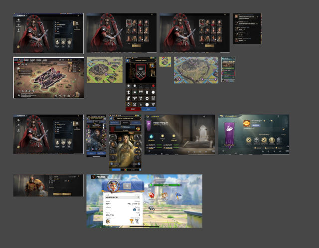
A collection of player profile examples from various market competitors.
Early in preproduction, it was unclear what kind of stats and information would populate this screen. Thankfully we had several market competitors to refer to, allowing me to make some educated guesses with my placeholder stats. It was a reminder that uncertainty and ambiguity in a design is OK! As long as the goals of the feature and the product are in focus.

An early pre-production wireframe of the Throne Room. Stats and other relevant info were invented to be replaced later on with more accurate reflections of the final product.
After some exploration, I went ahead with this version, which centers the beautiful character art. Important player details are arranged on the left side of the screen, with cosmetic details at the center, and social details and account options on the right. Centering the avatar would showcase the character art and their custom banner. An immediate impression of the player's identity would be made, from which the player's attention would go to either important stats or social signals.
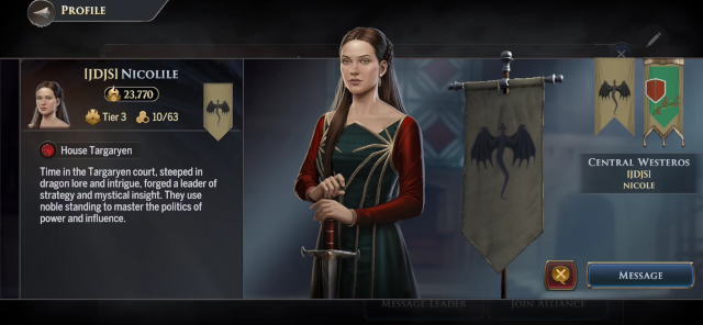
A screenshot of the final shipped version of the Throne Room.
In preproduction, I researched our prospective players and our competitors to understand this feature and what it would look like for our game. I worked closely with the product owner and other stakeholders to create a clickable prototype to prove my approach, with supplemental documentation to make implementation needs clear and accessible to developers.
When the feature was developed, I participated in playtesting and collected feedback to inform future improvements. Each stage required the product owner and stakeholders to sign off on the direction of the feature. When the feature was developed and in testing, I received a lot of feedback about the color picker in particular. Color options had originally been shown separately from the sigils and the background of the banner, but players wanted to be able to review both at the same time. The result was a pivot to this more approachable color picker solution.
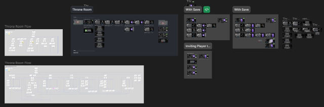
A screenshot of all the documentation created around the Throne Room, spanning from preproduction to post-launch.
I interviewed the product owner and game designer on their priorities, and defined UX's particular goals for dragon feeding. I then examined similar solutions from market competitors like Whiteout Survival and LOTR: Rise to War. I proposed an approach with visuals and a clickable prototype, checking in with stakeholders frequently along the way.

.png)