
Research on top app store games indicated that casual players who engage (and spend) the most prefer to play in short bursts, like during a commute. The same players tended to value attainable progression within those limited windows of time.
Dragonfire's hypothesis is that, if those complexity-curious players could be spared the friction points common to our market competitors, they would be more likely to engage with the deeper progression offered.
The core design challenge of Dragonfire revealed itself: Bring the depth of the 4x strategy genre to a casual mobile player base.
Three basic player personas were established by the product and UX team early in pre-production. These basic profiles would provide guidance for usability decisions throughout development.

Our primary audience. The complexity-curious casual player appreciates strategy and depth in their mobile gaming, but might struggle with the complexity and information density typical for the genre.

Fans of the popular Game of Thrones book and TV series, and/or gamers with a passion for strategy and RPG games. This player values robust social features and is likely to bring their friends along.

Casual mobile gamers who enjoy engaging with top app store games. This player will have high expectations for accessibility.
Dragonfire's UX thesis is an accessible 4x strategy game with a snappy core loop that fits into multiple short sessions of gameplay. It uses progressive disclosure to introduce complexity, one decision at a time, to reduce overwhelm. It offers attainable progression within those sessions, using micro goals and rewards to make time invested feel meaningful. And lastly, it would keep players engaged over the long term with seasonal content while also building a permanent legacy.

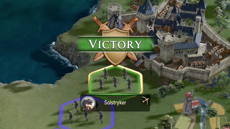
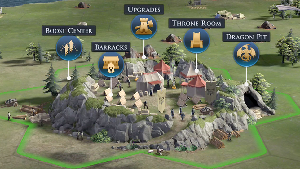
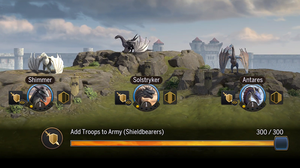



Player drop-off, particularly during onboarding, is a major concern for similar titles. In our research we identified several opportunities to reduce churn that could be applied to Dragonfire. The idea was that if we could keep casual gamers from feeling overwhelmed, they would be interested in the complexity that the genre had to offer. Respecting the player's time and mental resources would invite them to return for a fun and seamless experience time after time.
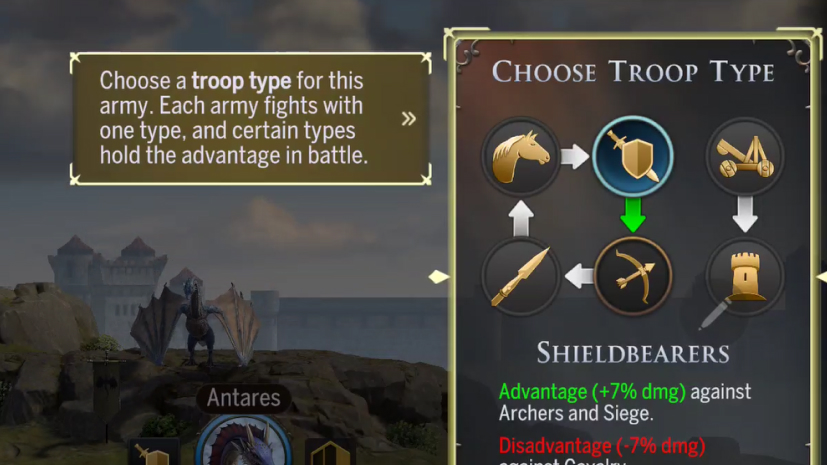
The complexity of the genre can be learned over time, introducing the player to new game mechanics one decision at a time.

Multi-step tasks are a common point of frustration and drop-off, especially for casual players. To avoid overwhelming the player's cognition, complex tasks should be broken down into smaller steps.
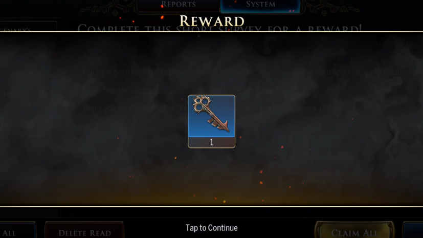
Use motion design to guide the player's attention toward the most important information or feedback.

Dragonfire is a UI-heavy game by nature. Decide what information should capture the player's attention first. The eye should flow comfortably over the screen layout.
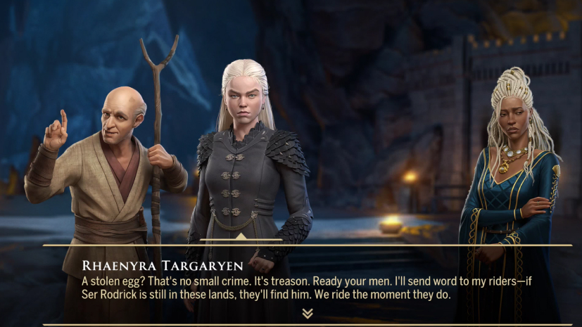
Immersing the player in the world of Game of Thrones, as well as inviting them to be a part of it, requires a UX that doesn't intrude on the experience.
Dragonfire's UX process always begins with research. Information gathered from market competitors and other examples helped us identify potential solutions to explore. I worked with product owners to understand the intent behind each mechanic and the business KPIs implicated. With design, I explored ways to simplify and present complex game concepts for a casual player base. I created prototypes to inform development and shed light on open questions around accessibility.
From there I would narrow down the scope of a design early, before a feature entered production, by having developers weigh in on the UX approach during prototyping. With plenty of time before development, we found many limitations and friction points to address. Upgrades, for example, required more streamlining to keep the player moving through the flow.
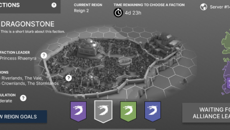

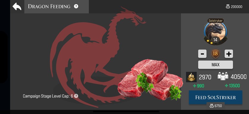
Trading XP for levels allows the player to increase troop capacity, gather more resources, and conquer more territory. The Dragon Feeding mechanic aims to give the player more ways to earn XP through completing tasks within the game loop, adding value to their dragon collection.
During early playtesting, it was revealed that dragons that were not slotted to armies quickly fell behind in progression during a Reign. To compensate for this, players would have to tediously swap out their dragons, a distraction from the core game loop. Players who joined the Reign during later stages would similarly struggle to catch up to their contemporaries. Because dragon progression resets each Reign, players needed more ways to progress their dragons throughout a Reign.
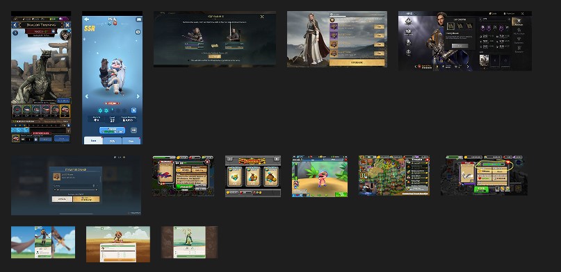
A collection of competitor solutions to XP Feeding
Due to the time and resource constraints of this feature, I worked closely with product owners and design to prototype and iterate on a solution that worked for every stakeholder. Art was a special consideration, as the success of the dragon feeding experience hinged on giving the player visual feedback for their interactions. Art and engineers stepped up to make it a charming and immersive experience, and QA helped me gather and triage feedback for iteration.
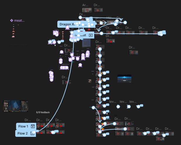
Dragon Feeding prototype interactivity in Figma
While it was tempting to make this feature into a minigame, I knew restraint would be required to ensure accessibility within the scope and timeframe allowed. I proposed gating XP spending by dragon level, meaning the player would not be allowed to spend XP unless they had enough to purchase an entire level. Design and the product owner agreed.

Early wireframe exploration of Dragon XP Feeding
The feature came about later in production, so the timeframe and scope were tight. There would be little room for risk taking on this feature. With that in mind, the next challenge was to present the XP cost and spending in ways the player could easily understand. The interactions had to be as clear and accessible as possible for this feature to be successful.
The final version of the Mercenary Faction screen
The dragon's current level is displayed on its portrait exactly as it appears in the dragon collection. The next level is the primary focus of the panel, with simple plus or minus buttons on either side, allowing the player to increase or decrease the target level as desired. The cost updates accordingly, and the relevant stats are displayed with the increases highlighted. The player understands precisely what they are getting in return for their investment of XP currency.
When the player hits the "Feed" button, a delightful animation plays, and stat increases are animated. Knowing that players respond well to unexpected rewards, I also convinced stakeholders to include a random bonus reward to positively reinforce the habit of XP currency spending.
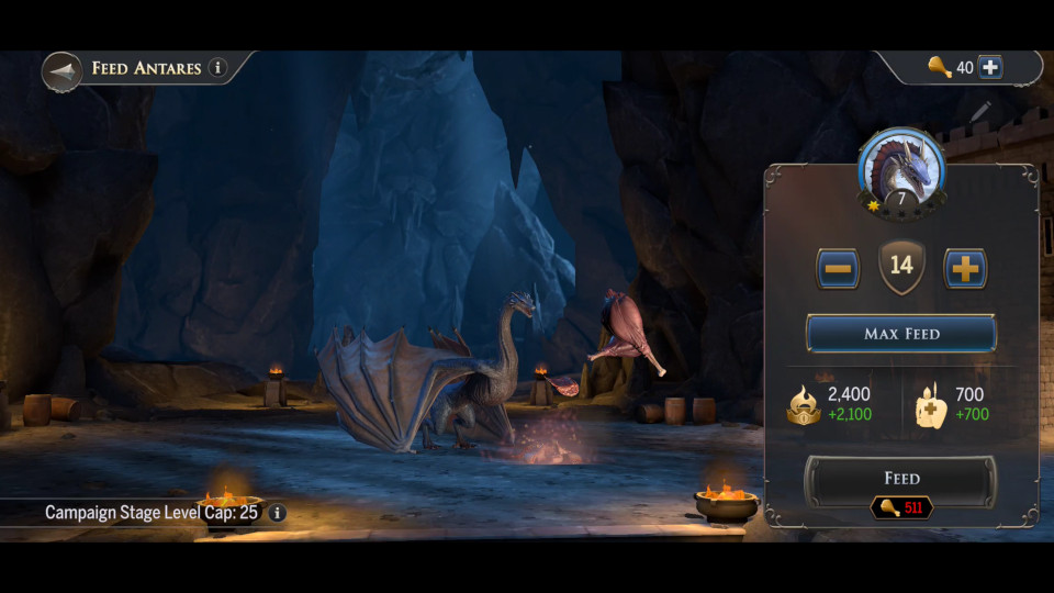
The final shipped version of Dragon XP Feeding
Players now have an alternate way to progress their dragons that doesn't require tediously grinding them in combat while conquering territory or killing mobs. As a result, the player's dragon collection grows in value and versatility throughout the Reign.
The experience of players bonding with their dragon by feeding them could grow into additional activities, like grooming, practicing commands, and flying exercise. I look forward to seeing more excellent minigames in this vein.
A game about contending for power requires opposing sides in order to create tension and engagement. Players stand to gain a sense of purpose, identity, and belonging in the game world by participating in an effort greater than themselves. Alliance Leaders would be the primary players using this feature.
Alliance Leaders are likely to be experienced midcore players, so the focus is on helping them decide which Faction their Alliance should be a part of in the coming Reign.
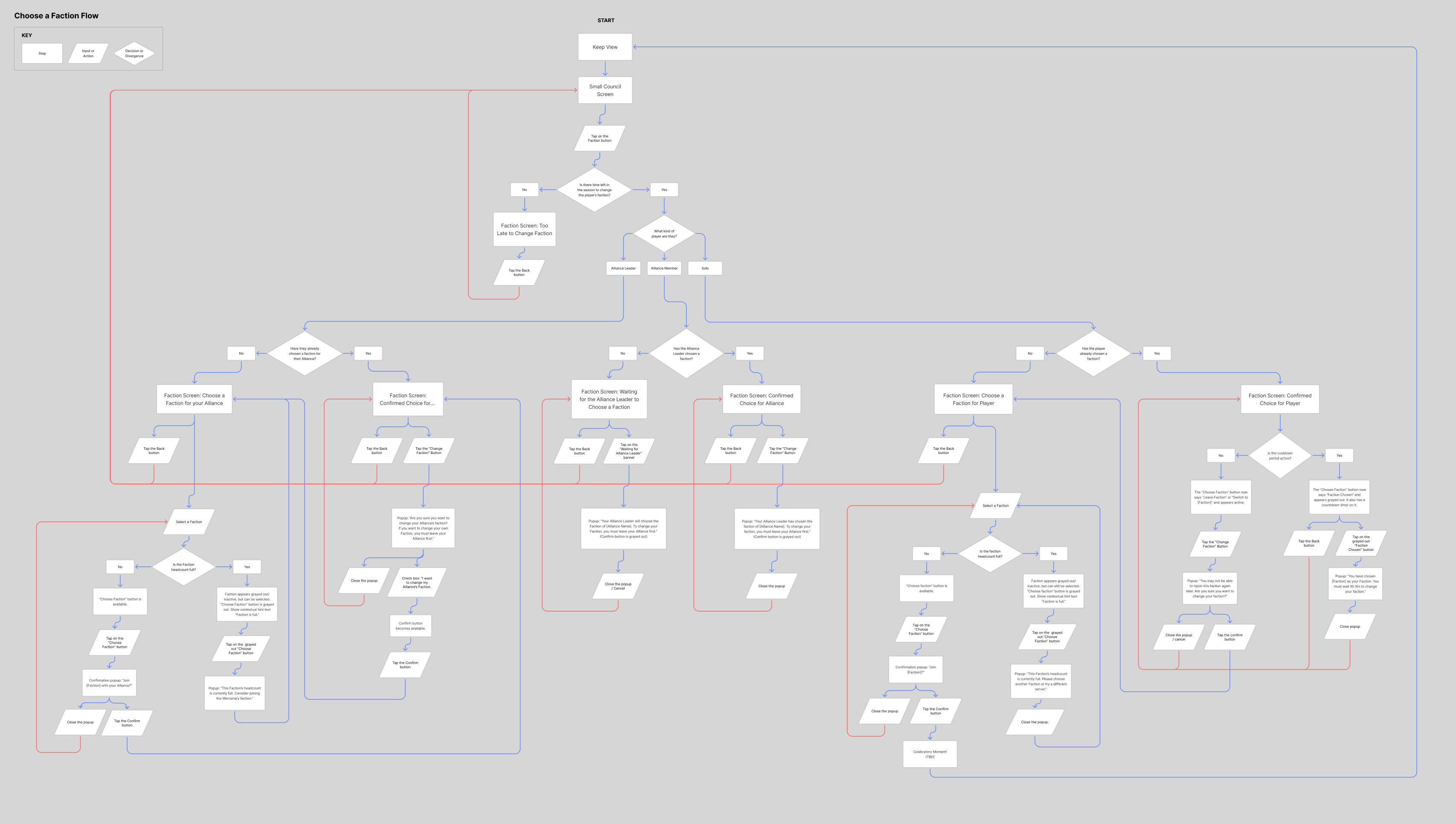
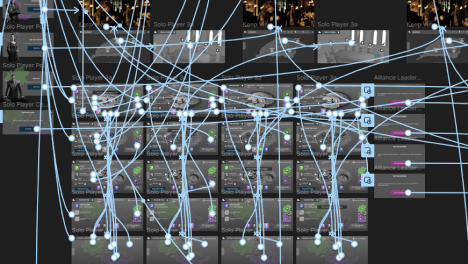
User flow chart mapping the Faction Picker experience
I set out to craft a feature that enables the player to make an informed decision about their Faction options. I familiarized myself with competitor solutions, discussing them with the product owner and design to better understand what they considered successful, and what approach might work best for our game in particular.
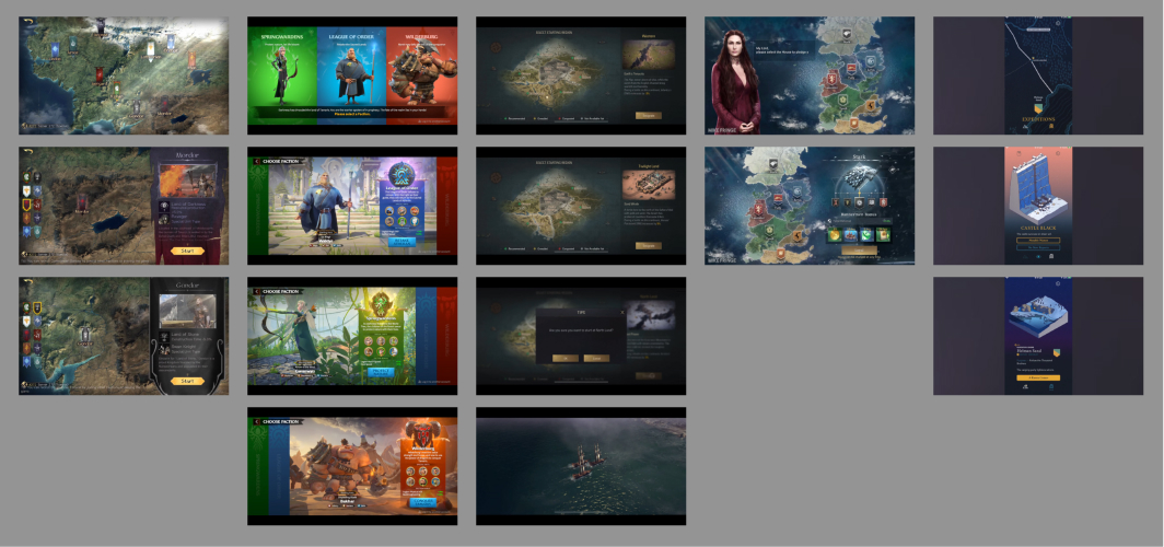
A collection of competitor solutions to the Faction Picker
While researching, I observed that an obvious, easy to use navigation was essential to successfully browsing options. Surface information could become overwhelming and should be kept to a minimum, hiding more information behind taps. Lastly, each Faction should have a clear and distinct identity.

Early wireframe exploration of the Faction Picker
Faction capacity was a potential sticking point for players. If their desired Faction was full, they might become frustrated and struggle to choose an alternative. Design hypothesized that incentivizing the player to join a "random" faction (one with a lower population) in return for a reward might alleviate this potential roadblock. I proposed presenting this solution as the "Mercenary Faction", which appeared equal to the other Faction options and resulted in some great concept art.

The final version of the Mercenary Faction screen
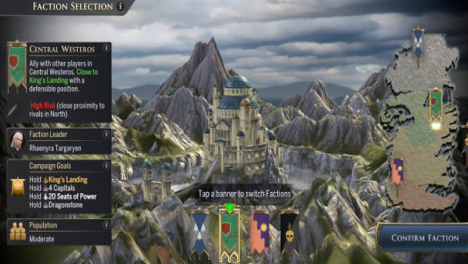
Because Alliance Leaders were likely to be experienced players, I decided to allow the NPC dialog to introduce the concept of Factions to casual players, and focused on the experience of browsing Factions and information instead. Playtesting the prototype on device and iterating revealed that placing the faction banners front and center, in easy reach of the player's thumbs on device, proved to be the winning strategy for navigation. Information was categorized and only the highlights were presented on each Faction's screen, with more available behind taps. Finally, I ensured that each Faction appeared distinct by reusing flyarounds of the 3D modeled cities as the backdrop.
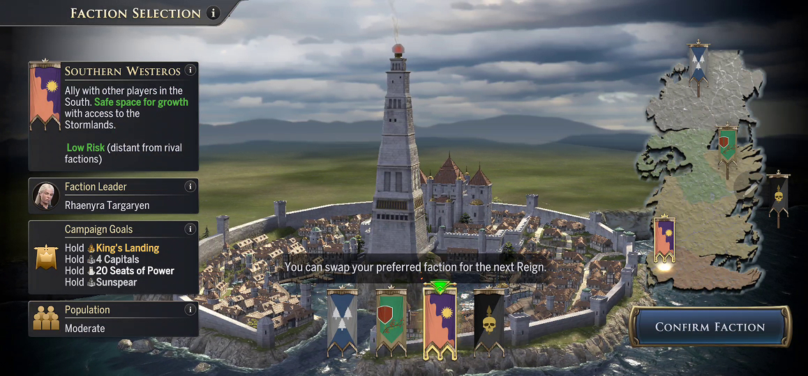
The final shipped version of the Faction Picker
Early playtesters reinforced findings from the prototype. Minimal dropoff occurred during these crucial early onboarding steps. The takeaway was that applying our UX pillars had worked as intended; minimizing the player's cognitive demand kept them moving through the process with minimal friction. The screen also proved to be a fun and engaging way for players to learn about the world without getting too distracted by the details.
Knowing that the number of factions per season would fluctuate, the navigation and layout should easily accommodate future additions. I look forward to seeing what future iterations look like!
In fast-paced strategy games, players need to be able to assess another player at a glance. Our main player personas, casual and mid-core players, needed to find the information they needed quickly and consistently.
The player dilemma for the Throne Room is twofold.
1. Later in a Reign, players will be contending for key strategy points on the map. This requires coordination with Alliance members and other members of their faction. End-game combat can be fast-paced, and decisions regarding other players must be made quickly.
2. The player is prompted early in onboarding to customize their own personal Throne Room. This would establish their identity in the game world. It would first need to guide the player through this process without losing them in this crucial early onboarding step.

Edgame chaos on the map.
First, I worked with the product owner and designer to understand the role of the feature in the game as a whole and the business implications involved. Then I observed video recordings and live demonstrations (from helpful coworkers) of the decision-making process in endgame combat from other strategy games. I noted what information those players were looking for to inform their decision. The other player's Faction, Alliance, and important stats needed to be readable at a glance.
I also needed to understand how a new player would be approaching the setup phase. It took careful observation of playtesting in the prototype phase and referencing of competitors to understand the challenges that new players would face going into this multi-step process.
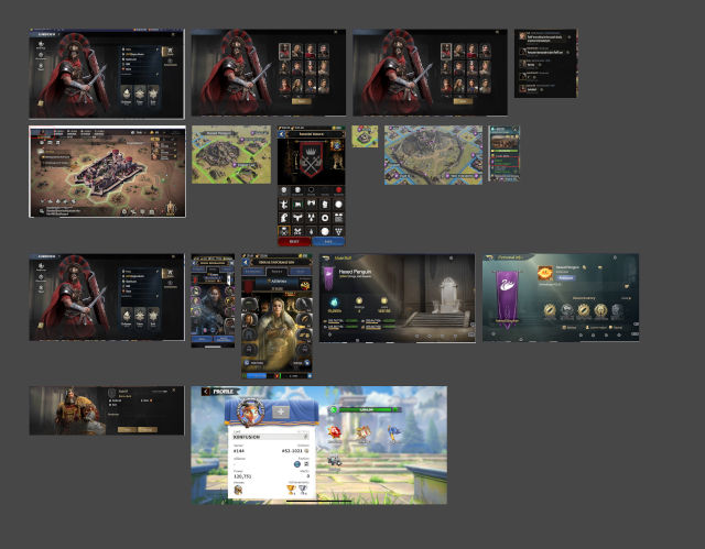
Competitor solutions to the Throne Room dilemma, highlighting the research phase.
The most important aspect to nail down was the "external view" of the throne room, the version that other players would be using to assess each other. This is where I started, using the same approach as the Faction Picker. Surface only the most critical information relevant to decision-making, and hide the rest behind extra taps.
Once that design was nailed down, I approached the experience of the player setting up their own Throne Room. This was a critical early step in onboarding, and it needed to guide the player through the process while reducing friction and drop-off points. To address this concern, I broke the options down into multiple tabs with sub-tabs. This allowed the player to customize one step at a time.
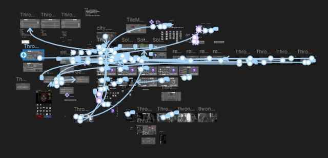
A screenshot of the prototype interactions in Figma.
Exploration for this feature began early in pre-production, before we even knew what kind of information would be presented on this screen. I made educated guesses based on preliminary design documentation and competitor examples. The feature was revisited at various points in production, revising for smoother onboarding, as well as use in later stages of gameplay.

An early pre-production wireframe of the Throne Room. Stats and other relevant info were invented to be replaced later on with more accurate reflections of the final product.
After some layout exploration, I moved ahead with this version, which centers the beautiful character art. Important player details are arranged on the left side of the screen, with cosmetic details at the center, and social details and account options on the right. Centering the avatar would showcase the character art and their custom banner. An immediate impression of the player's identity would be made, from which the player's attention would go to either important stats or social signals.

A screenshot of the final shipped version of the "internal" Throne Room view during onboarding.
Once the experience was built, playtesting confirmed the success of my approach; Players were able to identify at a glance what Faction / Alliance a player belonged to, what their key stats were (territory, power, etc), and decide their next move without getting lost in the weeds. More information was accessible at a tap.
The multi-step process of setup also proved to be successful in reducing drop-off in the onboarding process, which was extremely important for getting new players engaged with the game and hitting important KPIs.
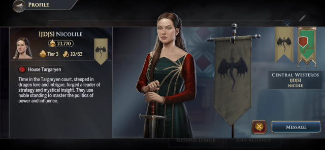
A screenshot of the final shipped version of the "external" Throne Room view.
This feature is expected to grow over the lifespan of Dragonfire. Seasonal content will allow the player to build on their legacy over time, and the best place to surface that would be the Throne Room. Adding tabs and other shortcuts to more information will be critical to keep those accolades from competing with important decision-making information.

.png)